Hello and Happy Saturday!
I’m so excited to be back with the Skipping Stones Design DT and can’t wait to share my first post with you for the January Tip/Technique Hop!
I received several amazing crafty products for Christmas (thanks Mom and Dad!) and I couldn’t wait to use my new Zig Clean Color Real Brush Pens for my card today. Actually make that cards plural as that’s part of my tip for you!
Often when I’m making scrapbook pages for my kiddos scrapbooks, I make two of the same page for each child sometimes only changing colors or small details. Taking that idea I wanted to use the same card layout with slight variations to create two cards from one concept in one sitting. (My second tip/technique is below my second card.)
With all your supplies out it’s super easy to generate another card but have it look completely different!
My first card is a softer look at Funny Coffee Vol #1 and making the cup into more of a tea cup with the Get Well Soon sentiment from Heart Song 2.
I started with a Calypso Coral card base and layered on a piece of patterned paper that was notched in the corners and then layered on a doily.
The tea/coffee cup was heat embossed in gold embossing power onto watercolor paper and then colored with the Light Carmine watercolor marker. I’m still a beginner with my new markers, but love how fun they are to play with! Still practicing and learning but having fun along the way!
I wanted to show this angle for the gorgeous gold embossing – look at that shine and a close up below!
The cup panel was adhered with dimensionals for a lift off the card front, and the sentiment was stamped, cut and layered over the main image also with dimensionals. A few gold sequins were added for accent.
Now that I had my first card done I switched gears copying the same layout and mapped out my variations.
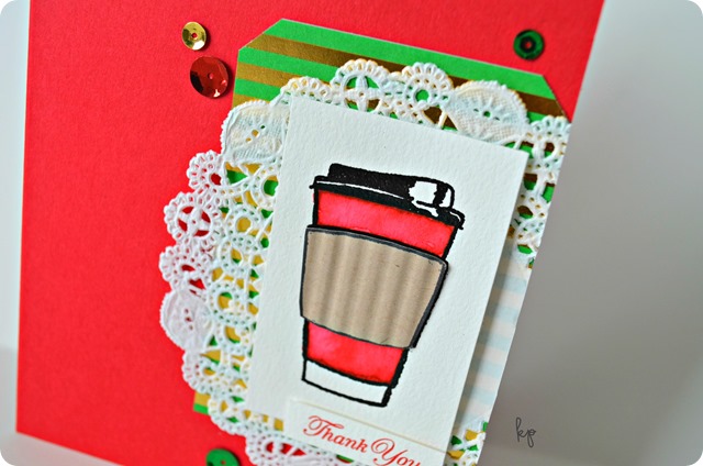
I still used Funny Coffee but pulled out the coffee to-go cup and the Thank You sentiment from Heart Song 2.
Keeping with the same layout, I used Real Red cardstock, a patterned paper piece and doily for the base. And yes, I totally played on the Starbucks Red Cup Controversy, but thought this was fun to use as a holiday thank you with a Starbucks gift card tucked inside. ;)
The image had the same treatment – heat embossed on watercolor paper and then colored in with the Geranium Red marker, and sentiment and sequins were mimicked from the first card with one change of cutting off the edge of the doily.
One more fun tip I have for you today is to pull out your old crimper! Didn’t we all have those back in the day?!
I stamped the cup onto Crumb Cake cardstock, cut out around the sleeve and ran the piece through my crimper. I then went back to cut around closer to the edges and secured the finished piece to the colored image with a dimensional giving it a boost to add to the texture and dimension of the cup.
Be sure to visit everyone along the hop and leave some love as there could be a stamp set or store prize for a lucky winner! Check out the SSD Stamp Store to make your wish list!
The order of the hop:
The Skipping Stones Design Blog
Larissa (Head here next!)
I’m playing along with the following challenges!
Simon Says - Something New (new markers)
The Card Concept #46 - Warm Heart (coffee cup and color inspo on Thank You card – Clean and Layered Style)


14 comments:
Wow...wow...wow...absolutely beautiful cards,I'll tell you I love the tea card because I'm a freak for tea!!! Thanks for sharing your tips,I'm new in card making and scrapbooking;I'm learning a lot!
Oh wow! These cards are beautiful! Thanks for sharing and Happy New Year!!!
These are gorgeous cannot wait to work more with you!!!
Gorgeous cards!! Love the gold embossing on the first and the crimped effect on the second. My crimper is regularly used as I use it to crimp scrap paper that I've cut into 4 by 5.25" panels for protection in mailing.
Beautiful design. Love your layered elements yet still keeping a clean look. Thanks for playing along with us at The Card Concept Challenge.
Wonderful layers and texture on both cards!
Very cute...I was wondering if Skipping Stones Design was going to have any posts this year...love the differences in cards with the same layout.
Thanks for the great tips on 'same but different '
Love the cards, second is my favorite. I'm new to card making and you make it seem so easy. Thanks
Very fun cards....nice simple design to do multiples!
Fabulous coffee cards, love they both look so different but are the same design.
Thank you for joining us at Simon says Stamp Wednesday Challenge.
Luv
Debby
The bright colors are fabulous! I, also, try to make multiples of cards when I can....if they aren't too complicated. Love your use of the doily and gold embossing on the first card. Pretty!!
<3 J
jwoolbright at gmail dot com
HerPeacefulGarden.blogspot.com
Great tips, Kandi! It's really amazing how completely a change of palette can make two cards look so different. I love the look of those Zig markers too...
Post a Comment