Saturday, May 26, 2012

Summer Fun – A Scrapbook Layout

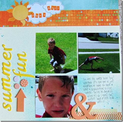
After all of the holiday layouts I’ve been working on it was a nice change of pace to whip out a summery page.

The story: Brady is such a water lovin’ boy! He has always been a fan of the water…bath time, swimming at the pool and even running through the sprinklers. As long as it involves water he’s happy!

The layout: If you’ve been visiting my blog a little you know I am such a fan of sketches as starting points for my layouts! This one was inspired by the Sketch #208 from Creative Scrappers. I used a neutral base and wanted to add some texture so I misted it with a blue spray mist. This also helped to mimic water. A few pops of orange and yellow finished it out with the title topper from Fancy Pants. 

Tip to Note: I wanted to use red on my layout to match Brady’s swim top but loved the look of the yellow, blue and orange paired together. I am a fan of using colors to match my photos, but sometimes it’s ok to just let those “internal rules” you have go out the window. ;)  You might be happily surprised with the results and ready to let other self imposed rules you have on your papercrafting slide every now and then.

Creative_Scrappers_208

Friday, May 25, 2012

Content – A Scrapbook Layout

Last May Jake and I were treated to a five day trip to Puerto Vallarta, Mexico as part of my Employee of the Year nomination.

(The coloring came out weird sorry!)

The story: It was an incredible trip, and was the first vacation we had taken without the kids in over 10 years! I wanted to document that experience and how much we enjoyed that time together. Of course we missed the kids, but we were content to just be us, husband and wife, totally in love.
The layout: I used the sketch below from Stuck Sketches as a starting point for my layout. I had a couple variations on the title placement, and sizes of squares and photo, but overall I think the layout shows the basis and inspiration from the sketch. I used an American Crafts collection for the bright colors that reminded me of Mexico.

Tip to Note: I am using my orange washi tape like crazy these days! For some reason it seems to work for a lot of my layouts lately. ;) If something is working, leave it out on your desk or table space so it’s within reach. :)

May 15th

Thursday, May 24, 2012

Must Love Dogs –A Scrapbook Layout

I have an awesome job. I work for a great company and I love the people, the culture and the way the company takes care of everyone. Not to mention the kick ass parties. We also do some pretty cool events and celebrate each holiday in our own crazy and fantastic ways.

Must Love Dogs

The story: On Valentine’s Day we had a photo contest where your team had to pick a movie title which best represented your relationship. Our team of girls decided that since we all have and love our dogs we would do our theme with the movie Must Love Dogs (sorry your head got cut off when I had it enlarged and printed Krystal!). We brought our dogs in as living props for our photo, ha, and were thrilled when we won! My puppy is the Siberian Husky (Ryker) that refused to cooperate and look at the camera. ;)

The layout: I am loving the doily look and found it was the perfect addition on this layout and was inspired by the challenge at  Scrap Fit to decorate with a doily. I knew I wanted to use hearts on the layout since it was around a Valentine’s photo and so used the patterned paper (American Crafts) paired up with some chipboard pieces by Pebbles. Hearts and doilies are just made for each other right?! ;) The washi tape and thickers are also American Crafts. The cute little doggy prints are from a Skipping Stones Design set and were stamped in gray on the background cardstock.

Tip to Note: The colors of the layout were completely influenced by the patterned paper. From the washi tape, to the base cardstock, and the chipboard accents I made all color choices based on that piece of paper. It’s really not a tip, but I love to play with a few colors from the patterned paper I worked with to complement the layout. There is yellow, gray and orange, plus a little pink on the photo mat that offset the paper and bring it all together.

We’ve definitely done some awesome events and great parties, can’t wait to scrap more of these and share!

Thursday, May 3, 2012

Utah Blaze – A Scrapbook Layout

I’m trying a little something new on the brand spankin’ new blog-o.

I learn so much and gain tons of inspiration from other bloggers and online galleries, and I’d hope that I can impart some of my own tips through what I share here or give you a little inspiration.

With that being said, I’m going to format my posts differently and provide some structure for myself. ;) I had scrapped these two layouts awhile ago and then never shared them so it’s good to get these on the new blog-o and finally share them!

The story: Utah doesn’t have an NFL team, but we do have an AFL team – Arena Football League. They play with shorter yardage so the games usually result in high scores and lots of touchdowns. Jake and Brady went to a Blaze Game and were excited to run into Shaky Smithson!  Shaky played for the University of  Utah where we watched him play, and now he’s a wide receiver for the Green Bay Packers!

The layouts: I was inspired by a previous sketch challenge for the first page to incorporate circles around a photo. I mixed and matched any papers I had in my stash that were orange, black and white as these are the colors for the Blaze. I also added in some washi tapes that complemented those colors and added a chipboard football.

Tip to Note: To give my circles more dimension I crumpled them up and then lightly smoothed them out before adhering them to my page. Since I went all out with patterned paper (try it, it’s fun!) I stuck to patterns that were smaller in scale for the circles while having the large sized stars in the background provided a good base.