Saturday, December 15, 2012

Christmas Brunch

I hosted some friends on Saturday morning for a fun Christmas Brunch and jewelry party. I had such a blast putting it all together!

Christmas Brunch

I had my table set up with lots of yummy breakfast foods, and my bakers rack served as a drink station. Come see!


DSC_0730

My bakers rack: the drink station!

DSC_0722

I decked it out with garland, beads and mini ornaments. These will definitely be staying up through Christmas!

DSC_0728

I had a tray full of coffee cups, creamer, sugar and coffee, and also had a cute glass jar filled with Bailey’s Irish cream to add to your coffee.

DSC_0736

I have a couple of these glass bottles, they were a fun find at Ikea a few months ago!

DSC_0732

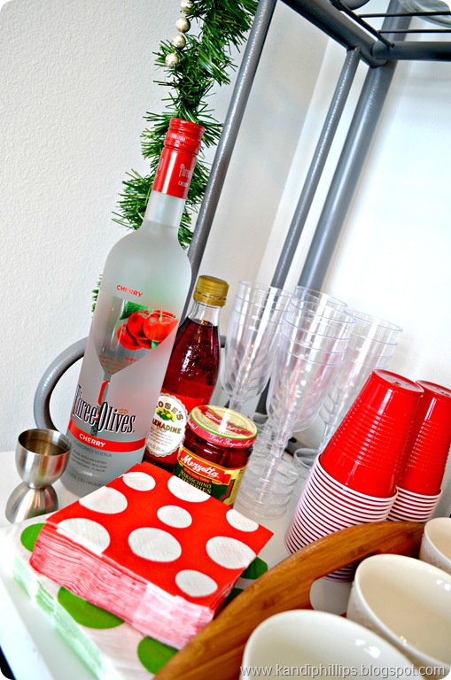
I did mimosas on the main table, but on this area I had everything to make Dirty Shirley’s which are basically Shirley Temple’s with vodka! (Thank you for sharing these at Bunco and giving me a new favorite drink Lyndi!)

DSC_0733

Dirty Shirley

  • 2 shots cherry flavored Vodka
  • Sprite
  • Splash of Grenadine
  • Maraschino cherries to garnish

Add vodka over ice in your glass, fill with Sprite, add a splash of grenadine and then cherries to garnish and stir. Warning: totally good and dangerous! ;)

Now the main part of the brunch!

DSC_0738

DSC_0740

I kept my red table runner and wood tray centerpiece that I had out for my Christmas décor, and added a black tablecloth underneath. I accented the table with doilies, pinecones, candy cane candles and silk flowers with rhinestone brads in the center. In a few places I used mini clothespins to add the flowers to the containers.

DSC_0741

Let’s dig into the food!

DSC_0745

I found the mini cups (Wal-Mart) that I put syrup in and added triangles of French toast to the edges for an easy and portable treat.

DSC_0748

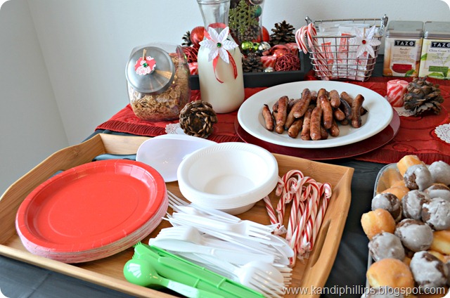
There were donut holes next to the French toast…..

DSC_0749

and a tray with silver ware, plates and candy canes.

DSC_0751

I also set out sausage and had a container of Special K and milk for any cereal lovers!

DSC_0750

I added a punched scalloped circle with a mini clothespin to the lid of the cereal container. For the milk carafe I tied some Christmas ribbon around it and added a silk flower with a green rhinestone in the center.

DSC_0752

I had a metal basket filled with hot cocoa mix and more candy canes, and another clothespin flower.

There were also teas, orange juice and lemonade.

DSC_0753

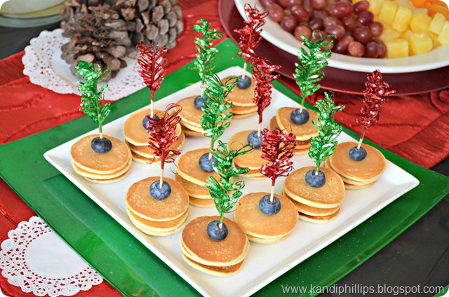
We also snacked on mini pancakes topped with blueberries and decorative picks. There was also a fruit bowl with mandarin oranges, pineapples and grapes!

DSC_0754

One more picture of these cute pancakes!

DSC_0757

The galvanized bucket/container held the chilled champagne for mimosas.

DSC_0756

These little flowers came from my scrapbook stash, I’ll definitely be reusing these!

DSC_0759

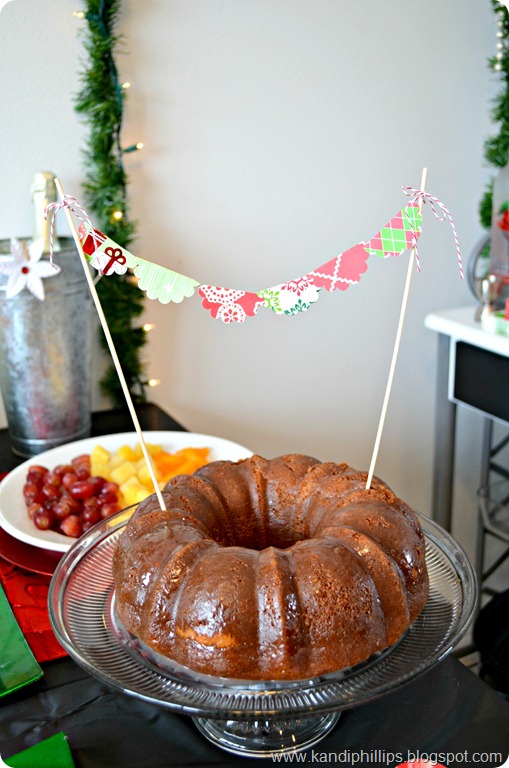
I also pulled out a few more things from my craft stash! I used bakers twine and more of the scalloped punched circles to make this simple cake topper. Christmas paper really added to the Christmas spirit and feel! :) This is Raspberry Liqueur cake that I got the recipe from my friend Sharon. It’s super moist and delicious!

DSC_0758


Raspberry Liqueur Cake

CAKE

  • 1 pkg white cake mix
  • 1 small instant vanilla pudding
  • 1 cup raspberry liqueur or framboise
  • 4 eggs

SAUCE

  • 1/2 lb. butter
  • 1/4 cup raspberry liqueur or framboise
  • 1 cup sugar

For the cake: Mix ingredients together well, bake in bundt pan at 350 degrees for 30 min. For sauce: Mix together all sauce ingredients in sauce pan, heat until melted. Don’t let it burn or get too thick. When cake is done, loosen sides and pour sauce over cake and sides. Let stand 20 minutes as sauce will soak into cake. Turn out onto cake dish.


DSC_0761DSC_0762DSC_0763

A few more shots of the whole set up!

DSC_0767

You may have noticed my “faux” chalkboard with the menu. Instead of an actual chalkboard, I used a black poster board and made it look more like a chalkboard by writing on it and wiping it off with a towel.

DSC_0779

It’s night time and all cleaned up but I think I’ll be leaving this up for awhile longer. :)

Wednesday, August 22, 2012

Knock Off Canvas Art

The house is coming along, and eventually it will be complete but I’m realizing that everything is about baby steps.

One of the small baby steps I took in our room was adding some custom canvas art. 

DSC_0121
It all started and was inspired by the prints below from Z Gallerie. At $89.95 a piece though I knew I could create something that mimicked that sun print look that I loved.

nature-study-4-taupe-730535561


nature-study-3-taupe-730557894


And then I saw this popular little ditty on Pinterest and it sort of set the stage for my grand idea.

151363237446631618_YOKtYWsx_c

Guys, I was literally dancing up and down in my garage when this worked!

DSC_0052

Michaels was having a sale on canvases so I snagged a 7 pack of the 11x14 size for $14. Not too shabby for $2 a canvas! I also grabbed some Christmas-ey looking floral pieces that were a dollar each and used the gray spray paint I had on hand.

DSC_0055

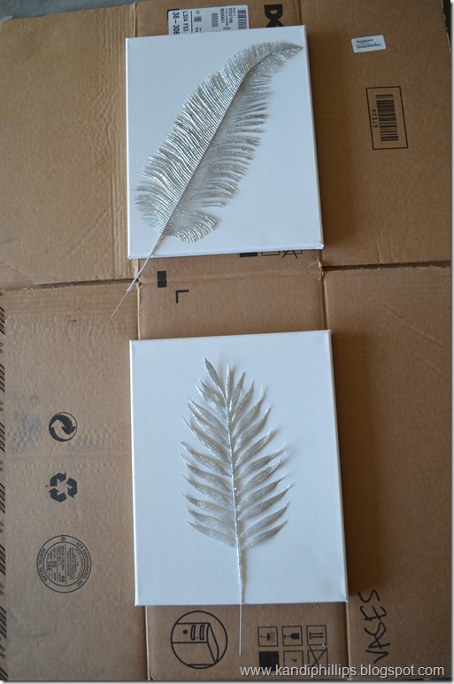
I started off by laying the canvas down and the floral picks on top. I ended up moving them to their own boxes so I wouldn’t over spray on the other. I missed taking a pic of spray painting because this was a one woman show and I didn’t want to mess it up! BUT…I spray painted it AND….

DSC_0057DSC_0059

Then I lifted off the picks and was left with these images! Seriously, this was where I started dancing around my garage! I let the canvases dry for a day and then thought about frames.

DSC_0068

I liked the look of the plain canvas, but thought it would look more finished with a frame. I found these wood frames at the DI for $1 and a quick coat of black spray paint did the trick. I worried about how these would stay in the frames since the canvas clips I bought at Michaels were too big. Turns out they fit inside the frames perfectly!

DSC_0072

All that was left to do was to add some saw tooth hooks to the canvas so I could hang them in our bedroom.


DSC_0121

DSC_0124

I’m loving these little custom pieces of art work in our room that I created for less than $5 a picture!

I’m in the middle of working on lamp shades for our repurposed lamps, putting together our end tables and deciding which route to go for this back wall (I have a ton of ideas but can’t settle!)….but I thought it would be nice to show you where they are at in the room. Gah…I have this amazing picture in my head of all the variations on this room, I just need to decide and go for it! ;)
DSC_0118

Anyway, it’s a process and it’s baby steps, but I’m so excited with how these turned out!

DSC_0126

Hopefully the next time I share something on this room I have several DIY projects knocked out in here. ;)

DSC_0128

So what do you think of my version? I’m liking them, especially the cost savings!


Linking up to:
BWS tips button

OneCreativeMommy.com

Thursday, July 26, 2012

Wrestling Scrapbook Layouts

I worked on some layouts Sunday and kept them pretty simple so I could get caught up. For some reason I’m gravitating to more grid style layouts.

StateDude, you won!

The story: These two layouts are from State Wrestling last year. Brady had a great match for 3rd/4th place and when he won we were so excited!

The layout: Both pages used Teresa Collins Sports collection and Prima Youth. Again, just some grid type layouts to get things easy on the page.

Tip to Note: I was able to use one 12x12 sheet of each patterned paper, but on both pages by alternating the sizes for each. It really helped to add more patterns without cutting into lots of sheets of paper.

I still have a few more layouts to share from what I did last weekend, it feels so good to get these done!

Monday, July 23, 2012

Parade of Champions – A Scrapbook Layout

Well, I’m finally to the point where I can unpack some of my crafty stuff! Now, that doesn’t mean I’ve done a whole lot of other moving/unpacking related things, but I know where my priorities lie. Are ya with me?! 

I spent Sunday cleaning, unpacking and crafting…and it was perfect.

Since it’s been awhile that I’ve had a chance to put my papers, tape and photos together I used a sketch from Creative Scrappers (#218) as a warm-up.

Parade of Champions

The story: In Brady’s second year of wrestling he was competing for 3rd/4th place at State. Since he was in the medal rounds he was invited to walk in the Parade of Champions. I loved that I was able to get such cute pictures of him! He had a blast and was so excited to walk!

The layout: This layout is based on the sketch below, and is a combination of two different collections (Teresa Collins Sports and Prima Youth). I mixed in some chipboard elements, and alternated the Thickers in the title to pull more of the colors together.

Tip to note: The long panel of Champion/Game was a full 12x12. I cut it in half, overlapped them in the middle and then placed my other papers over it. By doing this I was able to shorten it up without losing the elements on the top and bottom of the paper.

untitled

I was able to create several more layouts that I’ll share this week. I really focused on just “getting them done” so some are a bit more simple than others, but I’m ok with that.

We have a lot going on this week and weekend and hopefully I can get around to unpacking some more….craft or otherwise. ;)

Saturday, May 26, 2012

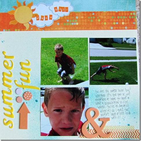
Summer Fun – A Scrapbook Layout

After all of the holiday layouts I’ve been working on it was a nice change of pace to whip out a summery page.

The story: Brady is such a water lovin’ boy! He has always been a fan of the water…bath time, swimming at the pool and even running through the sprinklers. As long as it involves water he’s happy!

The layout: If you’ve been visiting my blog a little you know I am such a fan of sketches as starting points for my layouts! This one was inspired by the Sketch #208 from Creative Scrappers. I used a neutral base and wanted to add some texture so I misted it with a blue spray mist. This also helped to mimic water. A few pops of orange and yellow finished it out with the title topper from Fancy Pants. 

Tip to Note: I wanted to use red on my layout to match Brady’s swim top but loved the look of the yellow, blue and orange paired together. I am a fan of using colors to match my photos, but sometimes it’s ok to just let those “internal rules” you have go out the window. ;)  You might be happily surprised with the results and ready to let other self imposed rules you have on your papercrafting slide every now and then.

Creative_Scrappers_208